UX & UI Design for Payment Apps & Digital POS
UPay
Uniware are a leading ePos and payment solution provider with hundreds of thousands of users. The business was established over 20 years ago, primarily servicing the education sector but it has grown to cover many of the country’s top corporates and retail establishments as well as strengthening their education credentials with many of the country’s top universities.
Designing a Mobile-First Brand
The ePos market has evolved rapidly with the rise of FinTech start-ups. Our challenge was to design a mobile-first brand that prioritises user experience in an innovative environment. We focused on streamlining complex user journeys, including product browsing, ordering, event booking, and payments.
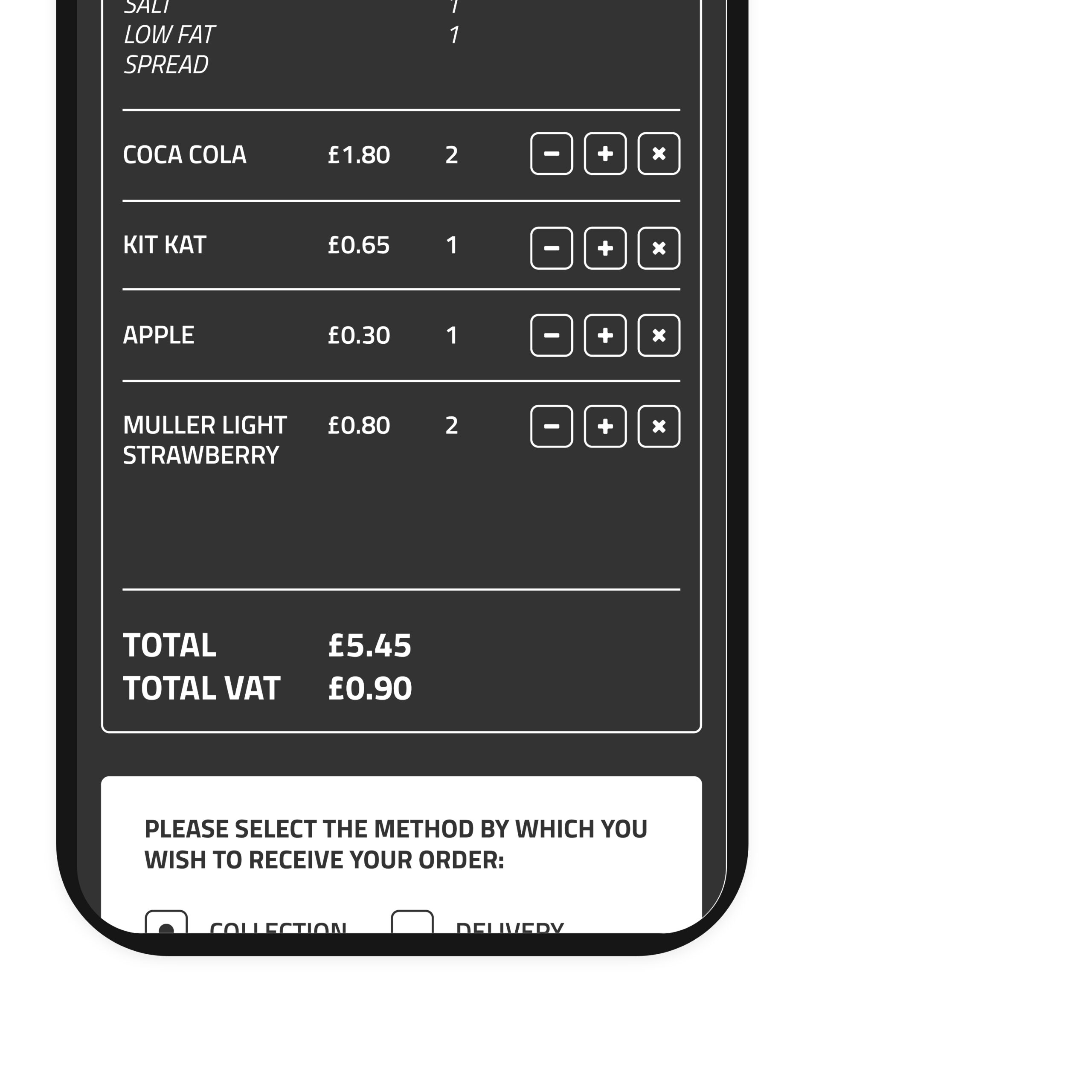
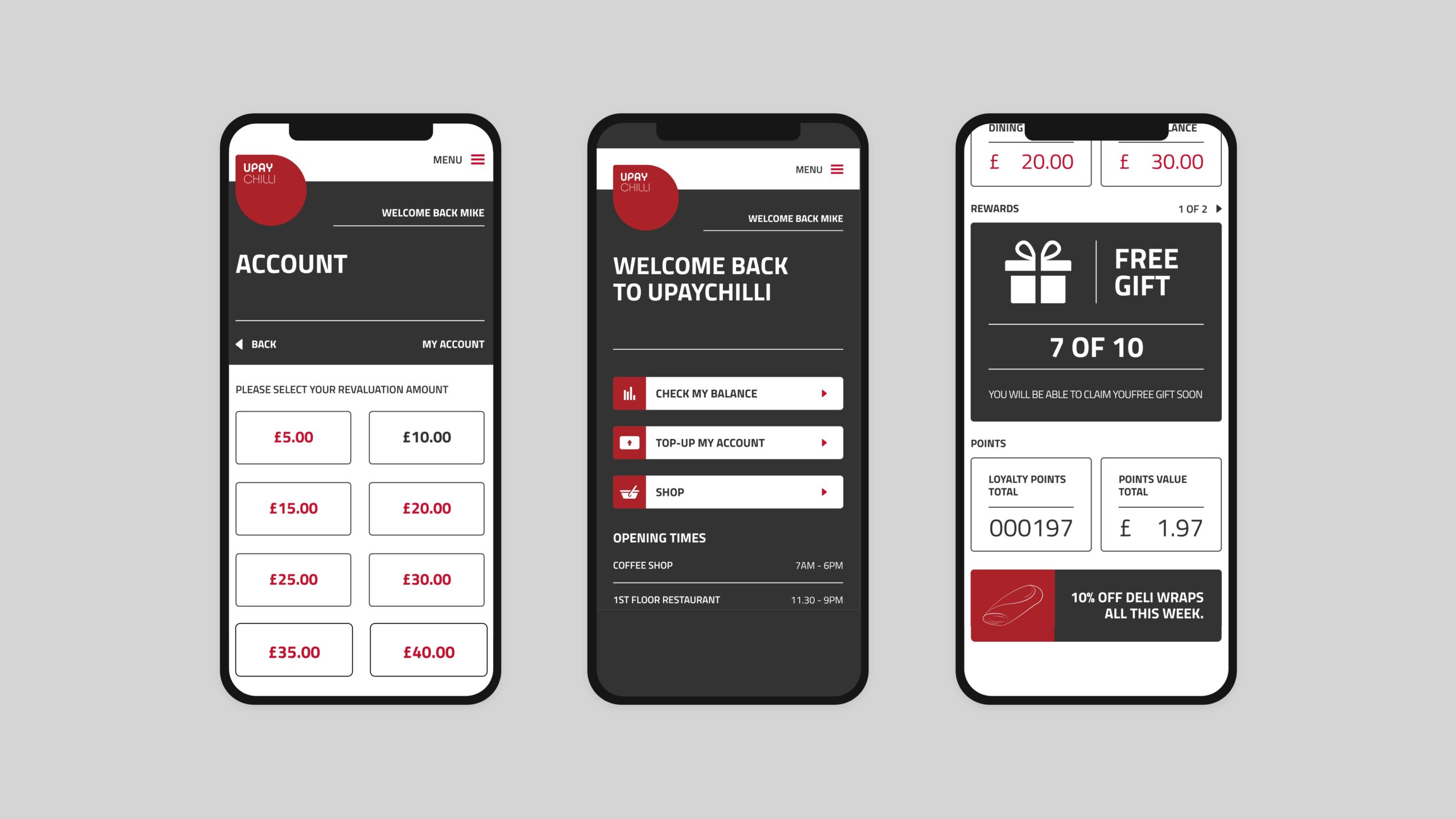
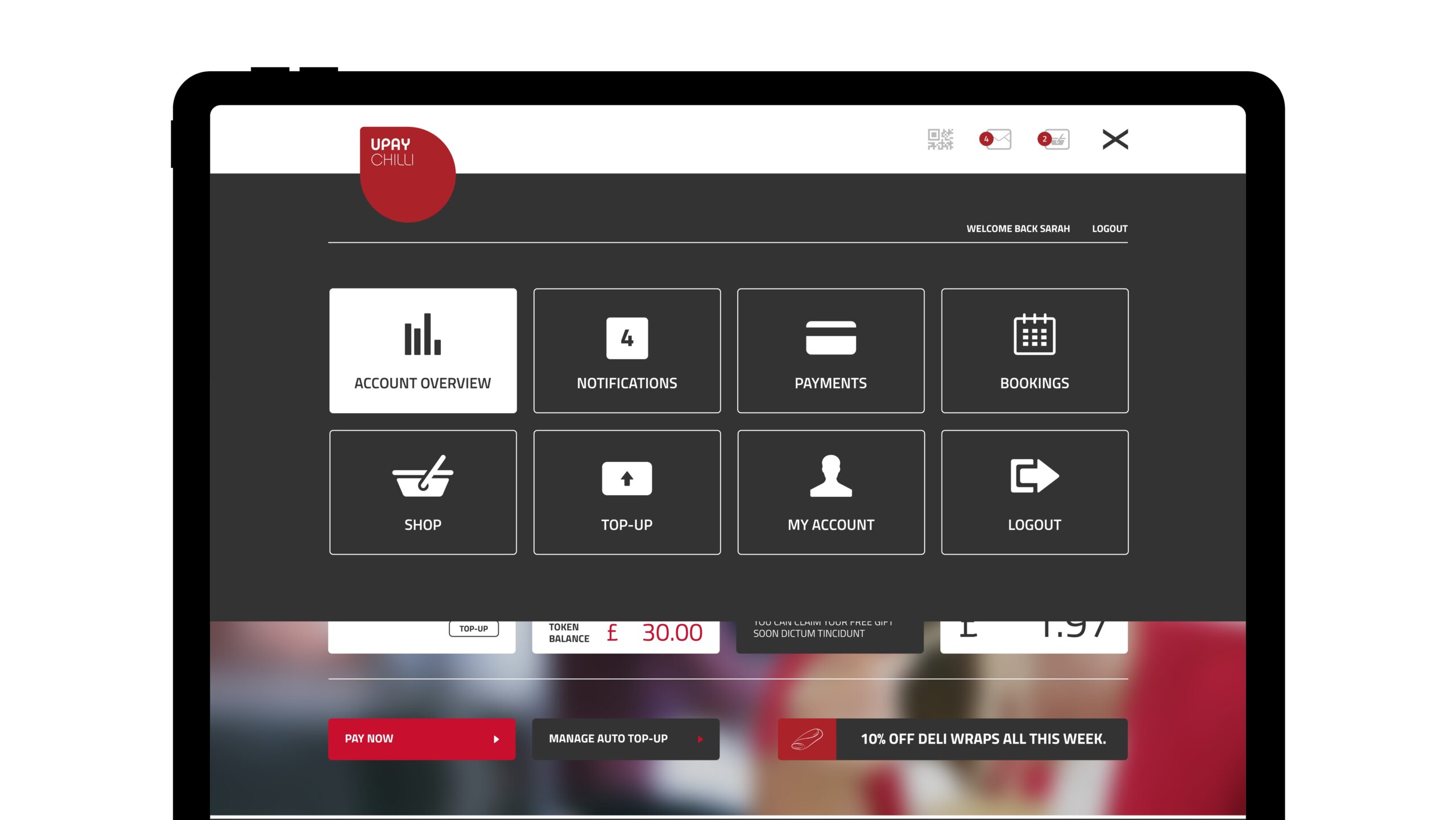
With the need for multiple financial systems, including cashless wallets, ordering and booking, with loyalty points systems and more, the design and functionality of the app had to be clear to users regardless of the complexity of their individual needs.
Revolutionising Mobile Payments
Wonderful’s UI-first design philosophy was based around the concept of refreshing the mobile payments industry with a new brand and style of user interface that placed usability at the forefront of UPAY services, and an interface that could be adapted according to business sectors and needs.
To maximise adaptability with clear, user-friendly design principles and comprehensive functionality, we established the concept of creating UPAY flavours. A flavourant is defined as a substance that gives another substance flavour, altering the characteristics of the solute. This fitted perfectly with the way in which the UPAY technology was changing and enhancing the payments process, disrupting traditional ePos models with an innovative, mobile focused suite of products – as well as creating clear pathways for user interaction unmuddied by a complex brand background.
We established a droplet design, which suggested the flavourant, as well as payments made by the user, that could then be ‘spread out’ to flavour specific technology implementations and user paths. These act as a repeat pattern, shapes within icons and animations or a simple way to bring a distinctive brand style to a design.
To emphasise usability, and prevent multiple payment technologies and options from getting lost within the design, placing intuitive, logical usability above decoration and styling.
Having finalised a design, and the user intent research upon which it was based, a prototype was created to test functions and ensure clear user flows across a variety of possible use cases. Through testing these processes, complex functions could be simplified in line with user experiences, prioritising actions and creating a clear hierarchy of systems and usage.
Seamless Brand Implementation
The brand has been implemented across offline and online media channels, including a responsive website, exhibition stands and print collateral. The customer experience is completed with a full new UX design of the payment apps and system, ensuring the brand delivers on its promise to change the flavour of making cashless payments.
Development of the app has continued over several years to deliver new functionality and services, expanding business abilities whilst maintaining a user-centric approach. The app has been used by hundreds of thousands of users in professional, consumer and student environments, providing data for future improvements and updates.